Mitchell Giurgola
Brand Identity
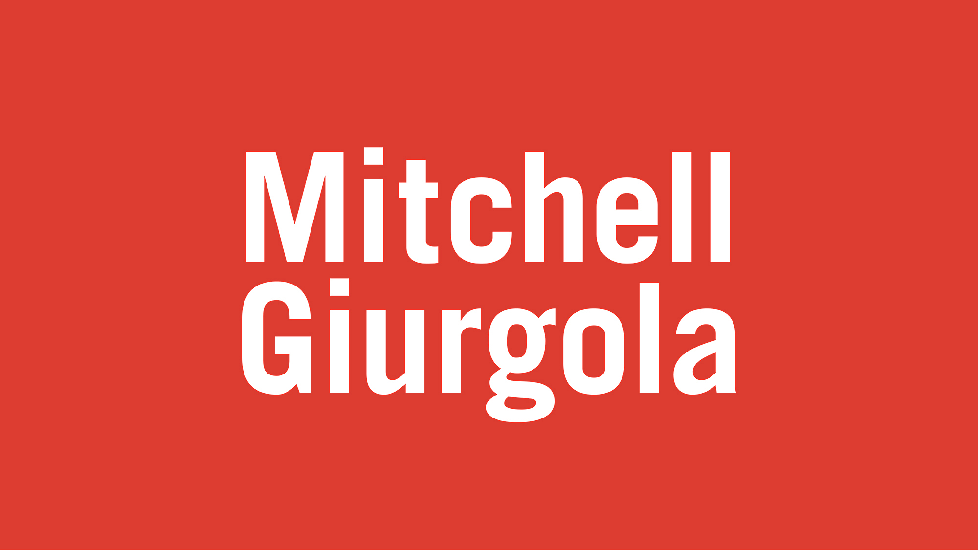
Mitchell Giurgola is an established New York City-based architecture firm that sought to refresh their image while preserving the brand equity of the original founders. As such, the firm sought a new mark that could be rolled out across all print and digital marketing. The existing logo had not been used consistently, and the firm’s name was so long that it often appeared awkwardly small. Any new logo would need to solve this problem, and satisfy other constraints as well: The names of both partners should be included without appearing to be a first and last name, and the logo should work in one color to provide maximum flexibility visually.
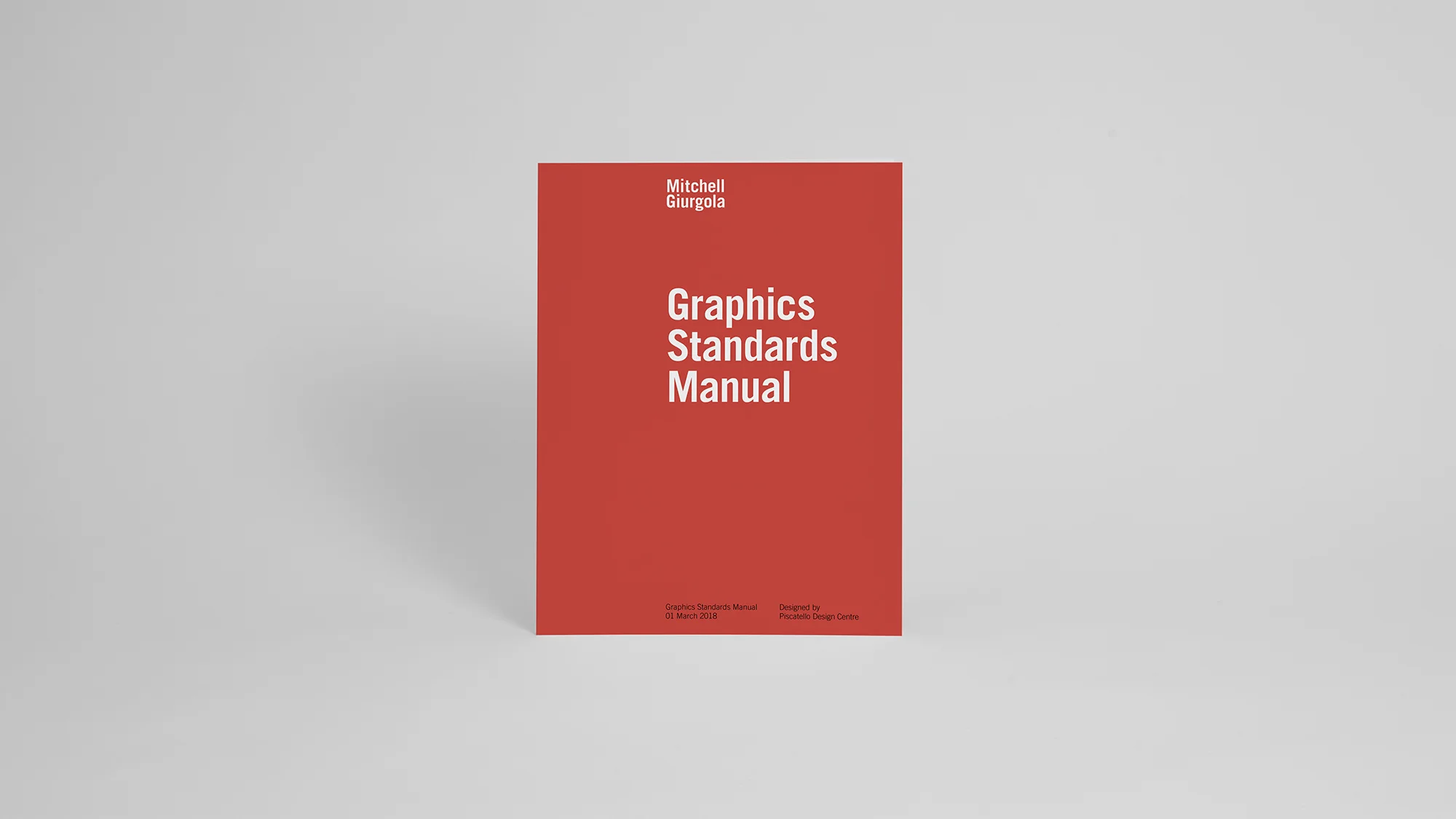
Leandra Tidwell, working with creative director Rocco Piscatello and the team at Piscatello Design Centre, designed a new logo for Mitchell Giurgola that is distinctive, contemporary, easily recognizable, and works well in different media. To develop the mark, the team led a multi-stage process including workshops and strategy sessions with the partners and senior staff to identify goals, define target audiences, and outline a vision for the future. The resulting mark was part of a new comprehensive identity system that also includes stationery, digital office templates, RFP documents, and presentation formats. The graphics standards manual provides detailed instructions on how to implement the new identity throughout the firm’s internal documents.
The team selected the font Trade Gothic because the font is distinctive, modern, and friendly. The lowercase g has a beautiful double-story and unique characteristics. Mitchell Giurgola has a history of using the color red, but the color was not consistently implemented across all applications. The team selected a rich, warm red that preserves the brand equity while providing a fresh new look and signaling a change. The team stacked the logo to create a strong block of text and to enable the logo to be larger in all applications to stand out and communicate confidence.


